

Optus ScamWise
Enable customers to be in control of their scam safety in the My Optus app.
Project overview
Since Optus’ cyberattack scandal, Optus has been on the path to regain public trust. As part the initiative to regain Australian’s trust, we noticed Australians are impacted by Scam in their day-to-day. This project aims to discover customers’ sentiment around scams, so we can provide a platform to help customers identify and report scams to Optus.
Role:
UX/UI Design
The team:
Director of new products
Product Manager
Tech lead
Business Analyst
Marketing
Timeframe:
Sept-November 2023
Success metric:
Adoption of App feature
The problem
Scams are a big pain point to Australians!
In 2022, Australians lost half a billion dollars to scams, receiving on average a scam every business day. Our research found that 65% of Optus customers are concerned about call and SMS scams. 70% of customers seek more guidance and expect their service provider Optus, to provide support.
Outcome
Since the first month of launch, we have achieved:
1 million views
47% usage among those who’ve clicked


So… How did I get there?
Design process
Adopting the double diamond methodology:
Diverge to research + discovery pain points and sentiment
Converge to defining the solution
Understand
Part 1 research: qualitative interviews and concept testing
Part 2 research: Quantitative Survey
Part 1 research: qualitative interviews and concept testing
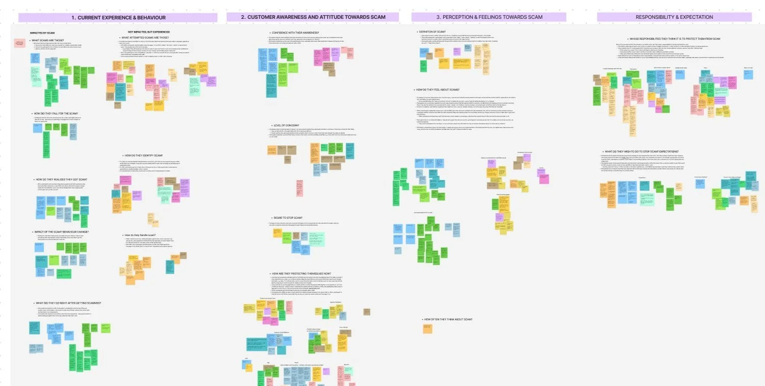
Interviewed 15 customers individually in 4 days, to understand 4 areas:
Their experience with scams
Feelings & perception of scams
Awareness & attitudes
Expectation on Telco’s role in protecting them from scams
We showed customers the ScamWise prototype to get their initial thoughts.
Part 2 research: Quantitative Survey
Based on the qualitative interview insights, we sent out 572 quantitative online surveys to validate the impact and size of the problems, so we can prioritise issues to solve.
For example, the survey gauged participants’ level of confidence v.s. concerns. If the majority has low confidence and high concern, that would be a problem to solve!
Key insight
Theme 1
3 in 4 customers don’t feel protected
“That’s on the person to be totally paranoid, it seems prevalent, but the one seems to be on the victims to be aware.” — P15
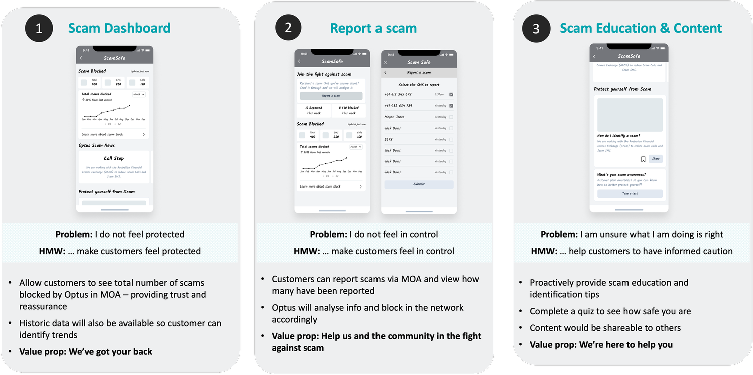
How Might We… make customers feel protected?
Theme 2
7 in 10 customers don’t feel in control
“If there was anything I could be doing, I would. But I don’t know what I could be doing about something like that” — P16
How Might We… guide customers to regain control?
Theme 3
>70% adopt the blanket approach to ignore scams
“Whenever I see an unrecognised number , I stopped picking it up nowadays, because they might be scams.” — P12
How Might We… help customers to have informed caution?

Ideate & Scoping
Brainstorming ideas based on the “How Might We” statements
I ran an ideation workshop with the technical lead, design lead, research lead and product managers. Based on 3 "How Might We" statements, we generated potential solutions for known customer problems. After dot voting and considering the Desirability, Viability, and Feasibility (DVF), we narrowed down to 3 main features.

Define & Design
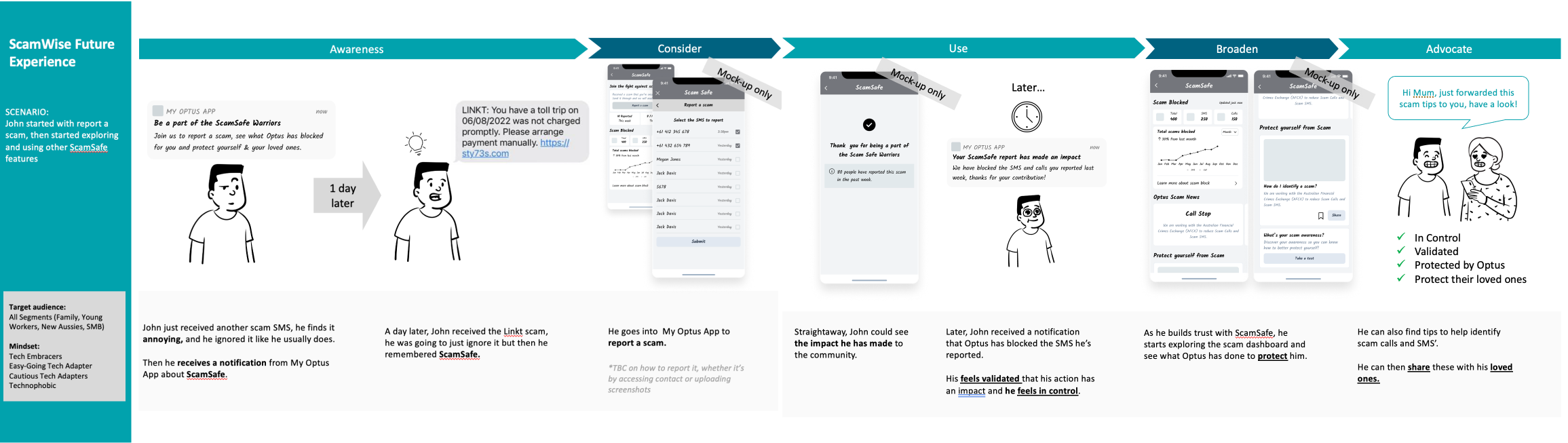
Future state journey mapping of the expected customer behaviours using the 3 ideated features together.
I storyboarded and visualised how these features work together to help customers in various phases—receiving a scam, managing the situation, and preventing “falling victim to it”. I’ve considered their experience within and outside of the app.
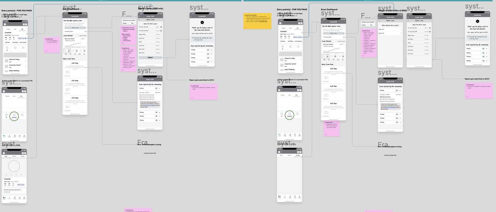
I began sketching the low fidelity design to visualise the in-app experience.
Visualising how customers will navigate through the app, considering the entry points, the information hierarchy, and the navigational flows. I love a low-fidelity design as it gives flexibility for adjustments during ongoing discussions about the product features!
Exploring UI options once the UX is near finalisation
For each feature, I sketched various ways to visualise the concept in the app. For the example below, I considered options for the “Trending Scam Reports," such as vertically stacked cards, carousels, and accordions.
I chose the "list" pattern so all the scam examples can be shared to other users altogether, and the pattern aligns with our App UI Kit style.

Testing
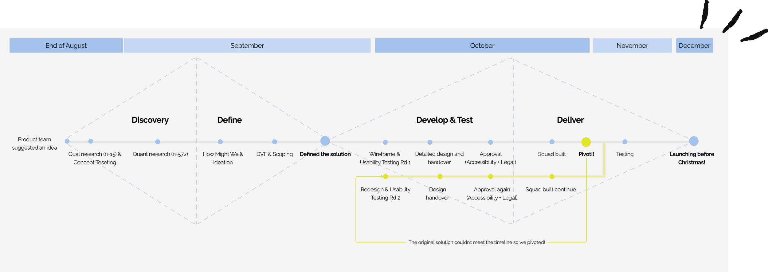
Technical solution changed leading to design changed
Pivot! Pivot! Pivot!
We did two rounds of usability testing
This is due to a solution change half-way through, as a technical dependency on the network team may have delayed the launch.
Round 1 Research Purpose:
Test discoverability of entry points
Comprehension of the 3 features
Task success and completion
🙆♂️ 5 usability testing in a day
Key findings:
✅ Simple enough, easy to understand
❌ Lifestyle image lack clarity
❌ Too many cards and too much scrolling

Round 2 Research Purpose:
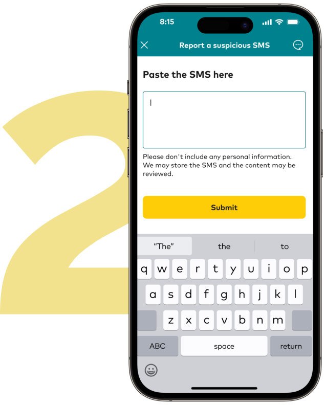
Test the new “report a scam solution” - instead of forwarding scam to Optus Scam short code 7226, report it in a form
Task success and completion
🙆♂️ 10 usability testing in a day
Key findings:
✅ Straightforward, just like the reporting forms in other companies
❌ Concern about accidentally tapping on scam link when coping it to paste in the app

Result
We managed to launch this after 3 months of design work
Once we iterated the design based on feedback, aligned with Marketing on the marketing matrix, achieved legal approval, tested accessibility and handed over to developers, we managed to launch this in time!
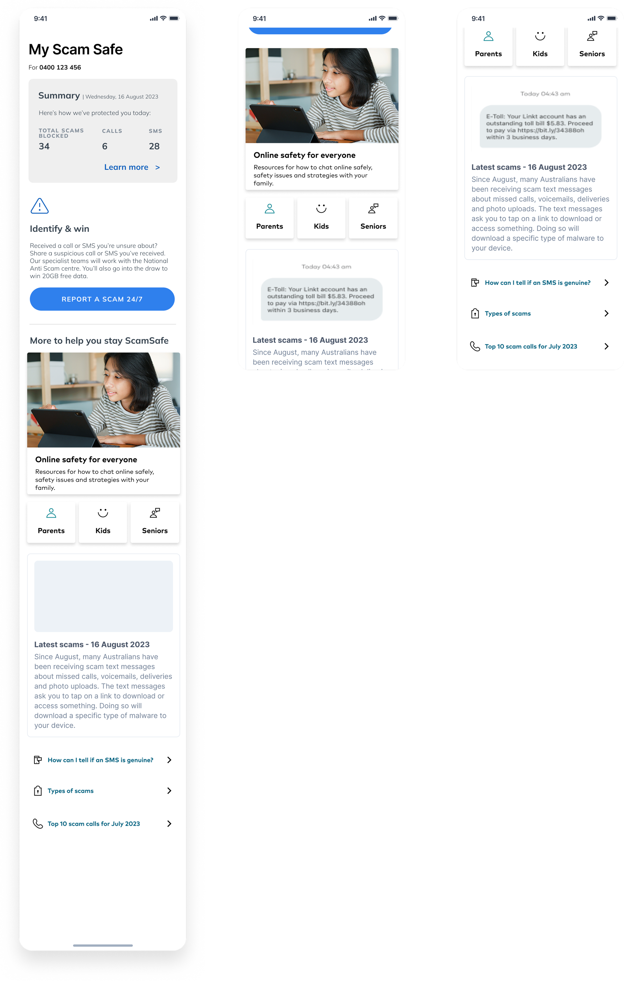
⭐️ 1 million views
⭐️ 47% usage among those who clicked
Key nuggets collected on my journey...
Challenges
1. Solution pivoted end of Oct when we have already handed over design to the developers.
2. There are many stakeholders in the project. Some stakeholders were engaged later in the process, making the approval process very rushed.
Learnings
1. Be flexible and call out for help. Do my best as a designer to redesign and don’t cut any testing or processes short even when there’s time pressure.
2. Engage with all stakeholders early in the process so they generate expectations. Brief brand, marketing, legal etc. earlier so they can prioritise and help more efficiently.